
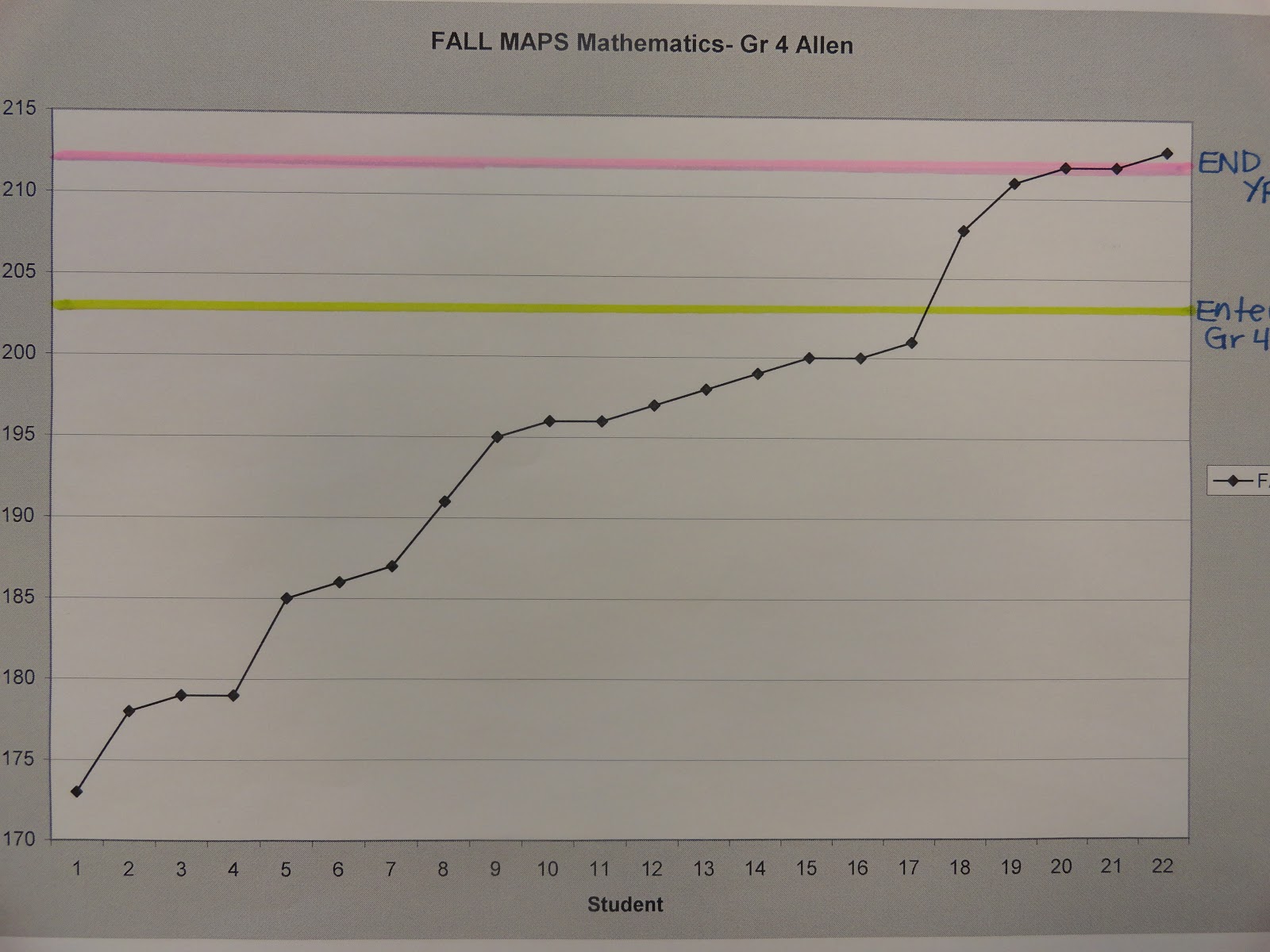
Oh goodness! Look at how many of my friends coming into 4th grade are below grade level in mathematics (green line=proficient upon entering new grade level). This data is from our fall MAPS scores. I make this line graph of my own to show representation of each learner in our classroom and the extreme varying ability levels for the parents to see. This is such an easy visual for each parent to understand on a smaller scale just exactly where their child is performing compared to their classroom peers, as well as proves for the parents how much differentiation must occur in the classroom setting!

Reading results don't look much better.
We've got alot of work to do this year! Just wait until I display the end of 4th grade MAPS Spring results!
It's the weekend...peAcE OUT!

0 comments:
Post a Comment